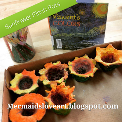
I was so happy with how these turned out in the past, that I can't wait to try them again this spring. It can be hard to find a clay project for very young students that turns out cute in the end, and does not have pieces falling off. This one has all that, AND they all look a little different. Plus, we have the art history tie-in of Vincent Van Gogh.
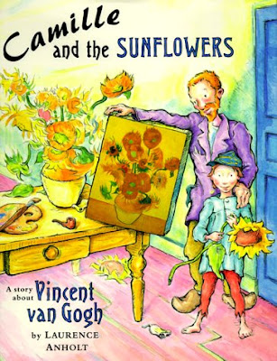
This is a two day project, which last year expanded into a three day project with drawings. On day one, we learned a little about clay. This is first grade, so we covered some of the basics of how the clay would change and become hard. I also read them a book on the first day, to get them thinking of sunflowers.
Then the students started with their pinch pots.
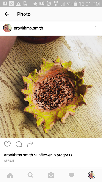
I used red earthen ware, and the kids pulled out the petals by pinching, and added the texture of the seeds in the middle with a wooden tool. This is also a good one for science tie-ins with parts of the flower.
If the kids had extra time, they were allowed to play with the clay to make other things. Sometimes I let them keep their creations, and if I am low on clay then it is just a "play time". They don't mind, because it is fun either way, and it allows for further exploration of the material.
I fire them over the week, so they are ready for step two. Sometimes I set the damp clay pots on top of an already firing kiln to dry them out faster.
Day 2 is our intro to Van Gogh and the coloring part of the lesson.
We observe his work. This is a book I used before I had a Smart Board to show the pictures.
We then use oil pastels to color and blend colors for the flower "pots". The kids also painted tempera paints over the oil pastels to fill in the gaps. Before students came in, I had already separated the colors they would need for both oil pastels and paints. I pulled yellow, orange, various greens, and browns. It worked great! Here's a video of the kids working on these, if you want to check it out!
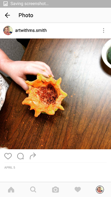
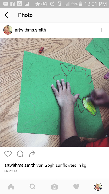
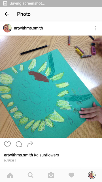
For early finishers I had green paper all set for the kids to do a drawing of their sunflower. They had the choice of zooming in or drawing the whole flower/group of flowers. It made for a nice display at the art show, with a lot of variety.
I hope everyone has a wonderful Thanksgiving break!
This is a k-8 art education blog, set up to help teachers and families incorporate art into their curriculum and their daily lives at home.
Tuesday, November 22, 2016
Monday, November 21, 2016
Frank Stella Collaboration
Good morning! This is a great lesson for when you are working on something else and the kids are all at really different spots. The final product can be as elaborate or as simple as you or your students choose. My kids were working on an intricate landscape before I did this project, so some were almost finished, and others may have barely started and were still focusing on details. As the students finished, they were able to start on this Frank Stella-inspired collage on their own. The collages in this post are by sixth graders, but I have done this lesson with fifth grade, and I've even tried a modified version with kinders in the past.
On day one we looked at Frank Stella's work, making observations in small groups and sharing out in a large group discussion. In the past, I have shared this Prezi with kids, which has a short video embedded that focuses on all different organic and geometric shapes. Organic and geometric shapes is one of the focuses of this lesson. We also focus on contrast, pattern, and repetition.
We discuss how Frank creates his own "canvas" by cutting different shapes, and layering pieces for depth.
Then it is time to create!
I have used tempera paint or acrylics for this, and I like to have some neon paint thrown in there for that fun, bright effect. I pre-cut lots of different cardboard (thick, thin, big, small, and corrugated). For paint storage, I usually just have it pre-poured in egg cartons, but since kids were starting this at various times, I let them pour three colors at a time on a tray, while I monitored.
For storage of these, I had each student write their name on an extra large "messy mat" (rough paper), and they kept all wet pieces on that mat so they would not get mixed up with each others' work.
Once the students have "enough" pieces (I give them a range of numbers, depending on the group and their ability level) it is time to assemble. Each piece must have a pattern or design, and they should have a mix of organic and geometric parts.
For this group, I plugged in a bunch of low heat hot glue guns and they took turns gluing. Tacky glue would work well, too. Some students also added marker details on top of the paint. For those with extra time, I allow them to add pipe cleaners and/or Twisteez wire to their sculpture/collage, for added "pop".
These can be displayed as a collaboration, or as a stand - alone piece. Here is one of the collaborative pieces we have done. In the future, I would incorporate abstract drawing and painting in the background, as well, to make the whole display more interesting.
Friday, November 18, 2016
Animal Relief Sculptures
This is my second year doing these relief sculptures. The kids really enjoy them, and they turn out cool for everyone. Last year when I did these, we focused on animals of Africa, in our "Around the World with Ms. Smith" theme. It is versatile, and would work with many tie-ins.
Before the kids came in, I mixed up a big batch of Claycrete (Amaco Brand), with water. I like to have it pre-mixed, and I use a mask because of the dust.
I've never tried Celluclay, but I think that comes pre-mixed, and I believe it is similar to this. You do need to keep it well-wrapped so it does not dry out (I use double ziplock bags), and I know there is also a shelf life to the Celluclay, if you choose to go that route.
On day one I had the kids draw their chosen animal and the environment behind them. This does not typically take a full 45 minutes, so I typically have them do this at the end of a previous lesson,
The next day is spent discussing "relief sculptures" and constructing the 3D faces of their animals. If there is a student who is more advanced, they can choose to do two animals.
On the third day the animals are all dry and ready for paint. I have tried acrylics and liquid tempera. At this level, either one works, but acrylics are better for the lighter colors, in order to cover up the cardboard.
If a student was absent for a part of the lesson, I combine two days in one, by having them sculpt the face and paint the background. That way the face is dry the next week and easily painted last.
Happy Friday, fellow artists and influencers :)
Wednesday, November 16, 2016
Monochromatic Grid Portriats
Hi all! This is a lesson I did with my sixth graders this year. In the past I did try it with my fifth graders, as well, but they did tend to struggle a bit. As for anything, it helps to be well-prepared and very organized.
I did this myself first, and I also created a hand out for students to plan with.
I also edited the students' photos first, to make them have more visible contrast. The next time I do this, I plan to zoom in more, as well, to focus more on their faces. You can see here, in my photo, how the contrast is less subtle than normal.
I also cut down each student's photo to 8x10", and the white paper we used was 16x20", to make for easy one and two inch grids. Students made the one inch grid on the photo, and the two inch grid on the white paper, after watching me first. I compared this to a "puzzle", saying it is easier to focus piece by piece, than on the whole puzzle at once.
I had them then find the different tints and shades and label them from darkest to lightest, using the numbers seen on the chart above. The drawings looked kind of like topographical maps when finished. Grids and pencil drawings took 2-3 45 class periods.
Next, we discussed color mixing, starting with lightest to darkest. We used egg cartons and plastic bags (labeled with each student's name) to store the acrylic paints, which worked well, especially because I see my sixth graders every day for a quarter of the school year.
The kids then painted their different tints and shades onto the chart I made, so they could refer back later. to the corresponding numbers on the grid and drawn on their portraits.
You can see the different shapes showing various tints and shades....
Having the different colors mapped out ahead of time seemed strange to students, but it really helped later on.
The final step was to use a broadline sharpie marker to go over and smooth edges, or color in the very dark areas. In the future I would actually eliminate the black paint, and just use white, the chosen color, and the black sharpie. It is less confusing for color mixing, and it would cut down on wasted paint. Aside from yellow, or possibly orange, I don't think the black is even necessary.
Thanks for stoppin' in :)
2-In-1 Monoprint Collage
This is a fun lesson I just did with my adaptive high schoolers, but I have done this with second and third graders in the past. It is great because you get a "bonus" product at the end: a beautiful collage, as well as a print.....or two.....or three.......or ten.
We start with an intro of Louise Nevelson (there's a link to my Nevelson Prezi if you would like to use it). I love to plug those powerful female artists whenever possible ;).
Next, the kids get to hunt for "junk" for their sculpture. I have done this two different ways. One year, I had other things that had more volume, like tubes and small containers or lids. With this method you have to use tacky glue or hot glue (harder if you have young students). You also don't get the "bonus print" with this option, because you can't print with all the unlevel "junk".
This year, I limited our found objects....
....and I found the method of making to be much easier, and the results to be just as cool. Kids used cut cardboard, twine, foam core pieces, and corrugated cardboard to make different textures and shapes on their cardboard bases.
Once finished, they chose a paint color (we used liquid tempera), and they painted the whole thing.
After their painting was done, I had them brush over the tops of the objects they glued down, one more time, to make sure the paint was still wet enough to make a print, and then they pulled their monoprint on a different color.
I let the kids choose their color this year, but if I do this again, I think it would be cool to have them print on a complementary colored paper, for a little added color theory.
The last step was to dry brush some metallic over the top to emphasize the textures, and voila! Nevelson Collage ;)
Friday, November 11, 2016
Primary Color Hot Air Balloon Weavings
"Oh there are three primary colors! Only three are primary, it's true!" I LOVE THIS LESSON! It is a cute product, packed with lots of fun and many concepts for the little first graders who made these. This was a lesson that took us three 45 minute class periods.
The making of the loom itself, and the discussion of weaving took most of the second class, and then students got to begin. To prep for these looms, I cut my brown paper into 9x9" squares, and my red, yellow, and blue into 1x 9" strips.
I also cut red string to later tie them to our balloons. When finished, we used glue sticks to stick our strips down. I have the kids wait till the end for the gluing, in case of a mistake. I also left it up to them whether or not they made a pattern with the colors. I felt they had enough to think about with the weaving itself.
They sure look cute all put together! Can't wait to hang them up :)
Thanks for stopping by! :)
On the first day, we started with this excellent book (don't leave home without it):
Following the book, students were given red, blue, and yellow liquid watercolor paints, a dropper, and a piece of color diffusing paper.
I glued down some little disposable ramekins with lids, onto some extra paint pallets I had, to help prevent spills and drying out of paints.
The color diffusing paper I had was quite large: 12" diameter circles. If you are unfamiliar with this paper, it just behaves a bit like fabric, and you can stack them to let the paint soak through, if you want multiple paintings in one shot. It dries fairly quickly, and it is easy for kids to cut. Here's a quickie video to show you another example of how they could be used.
Before the kids came in, I trimmed up the paper a bit to make a more "balloon-like" shape. My picture doesn't show it, but I also punched two holes in the bottom of the balloon, to later hang our "basket" weavings.
Kids got to painting, and were encouraged to try mixing colors. I found that if you drip straight water onto the paint, it will also add to the cool tie dye effect.
This paper is also great, because you can see the color from both sides, for when we hang them up!
DAY 2 & 3 were all about weaving.
I started by showing the kids how to weave on a larger scale loom (thank you, once again, Cassie Stevens). The loom I made is exactly like this, but I left mine at my other classroom, and don't have it to show you at the moment...
The making of the loom itself, and the discussion of weaving took most of the second class, and then students got to begin. To prep for these looms, I cut my brown paper into 9x9" squares, and my red, yellow, and blue into 1x 9" strips.
I also cut red string to later tie them to our balloons. When finished, we used glue sticks to stick our strips down. I have the kids wait till the end for the gluing, in case of a mistake. I also left it up to them whether or not they made a pattern with the colors. I felt they had enough to think about with the weaving itself.
They sure look cute all put together! Can't wait to hang them up :)
Thanks for stopping by! :)
Tuesday, November 1, 2016
Radical Radial Prints
Well, in my art room, we are gearing up to start all different kinds of prints! This first lesson is one that I have used with fifth grade, and also with my adaptive high school art kiddos. Results are really cool, and this lesson allows for some art history in printmaking (Andy Warhol Prezi) if that is the route you want to take. It is also a good example of radial balance in art, and balance in general.
On the first day, we start off with the introduction (and/or review) of BALANCE. From there, I show the kids the wet on wet watercolor technique...
I like to use liquid watercolors for this lesson, because it really works well to give that "tie dye" look...
As you can see, I have the kids start from the middle, and design toward the outside. If they cannot find the exact middle, it is not a huge deal, because they will be covering most of their painted design with a print later on in the lesson.
This first step takes the whole first period. The nice thing is, if a student was gone the first day, it is not the end of the world if they skip this part, because they will still be getting the concept of "radial balance" the next day with the printmaking.
ON DAY 2: I have the students design a pattern coming from one corner, and radiating outward, so that when they print, they will have a radial design, once again. I pre-cut the squares of paper and foam to be the exact same size. The ones seen here are 4x4" squares.
Once they are done with the drawing, they tape it onto the foam (I use Inovart printfoam OR Scratch-Art Scratch-Foam), and they push to make the design come through. They do this step twice: once with the paper, and once without. On the back of the foam I have the kids LABEL THE CORNER WHERE THE DESIGN STARTS, so that they know which corners to line up when printing later on to get the radial design to work out.
Next, we ink with black block printing ink and a brayer.
Then print four times! If students finish early, I let them print again in a different way or on different colored papers if they want. Some of them like to trade print plates and print from their neighbors, too.
Now go get your Warhol on!! :)
Subscribe to:
Posts (Atom)